

Artwork Guidelines
We’re all keen to see your job printed perfectly. If you are thinking of ways to ensure your file is as well prepared as possible please take a look at these tips from the repro team at Orphans. If you are unsure about any aspect of your artwork, please get in touch with Gary or Peter who will do their best to assist.
Colour
When it comes to printing, it is important that your artwork is always set in CMYK (cyan, magenta, yellow and black), unless you require a specific colour that can’t be accurately mixed using this model. All images that you find online or take yourself on a camera are in RGB, which is a different colour range to what is used in printing. RGB can create more vivid colours than CMYK, so it is important it is converted before it comes to us to make sure you are happy with how it looks. Of course, if you are unable to do this, we will convert it for you and you may then see a difference in the proof you receive from us. If you require a specific colour, we use the PANTONE® colour system. If you have seen a specific PANTONE® colour you would like, please let us know so we can quote for this accordingly.

Text & Type
We often find that when documents are supplied to us, one of the most common issues we face is text. Desktop publishing software such as Word or Publisher often creates the colour black using RGB, which converts to 4 colours rather than 1.
This isn’t ideal when printing black text, as even with the latest presses it can stretch tolerances and make registration more difficult. If text is only made up of black, this eradicates the problem. Obviously, if you are using coloured text, then supplying it in 4 colours is fine. So if your text is black only (or a tint of black), make sure it is only using black and no other colours are used to create it.
Missing fonts can also be an issue. If you are using a program such as Adobe InDesign, please either supply the fonts or outline them completely in order to get round this problem. We can do the last step at this end but if it has arrived with a missing font, we will not know what the original one looked like so it is better to have it done before it arrives with us.
Bleed, Trim & Safe Area
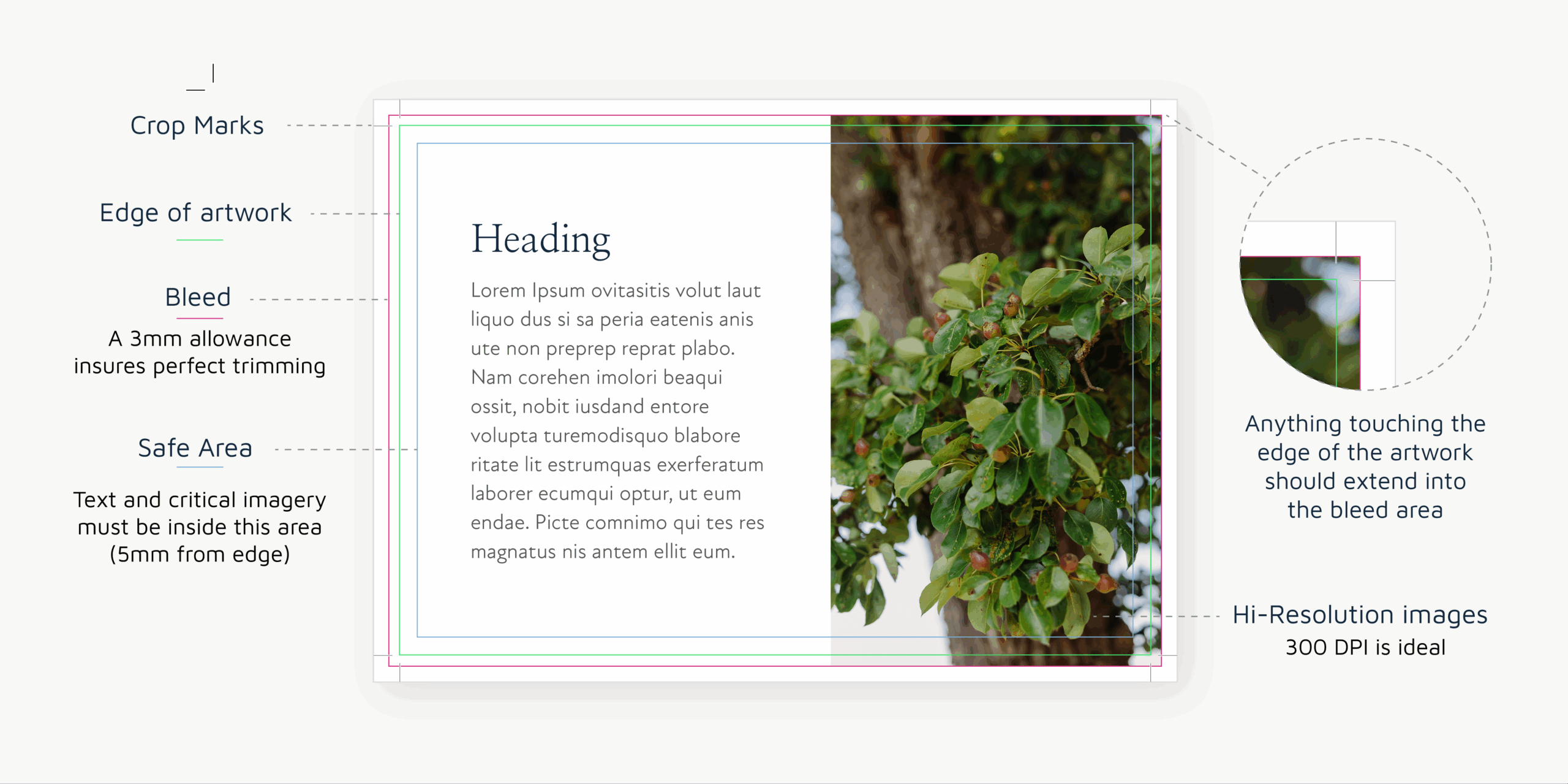
‘Trim’ area is the finished size of your document. You need to make sure that there is nothing close to this area that you don’t want trimming off accidentally, for example, text and images with a white border. The final is the ‘bleed’ area. On all of our artwork, we require 3mm bleed around the outside of your document. This will prevent any white edges showing where an image should ‘bleed’ off the page, i.e. reach the very edges. So, you should make sure your image flows into a 3mm outside border.
All documents that are supplied to us must adhere to three aspects. The first one you need to be aware of is the ‘safe’ area. Your content should stay within this area to make sure it still looks perfect in the unlikely event that the final cut is slightly off. A 5mm border all the way round the inside of your document means you will err on the safe side.
Pictures
Pictures can paint 1000 words – but only if they can be seen. File size is very important when it comes to printing. We require images that are at least 1mb in size in order to get them printed at a good standard. Also, pictures taken from the internet are usually at a resolution of 72dpi which very often can lead to blurring when printed. You also need to make sure you have permission to use the image! Images cannot be used from the internet without permission from the author/ designer/ photographer/ license holder. If you supply us images without permission, we cannot be held responsible. Back to file sizes, ideally, we want images that are 300dpi and, as said above, need to be converted into CMYK – we can help with this when we receive the artwork.
File types and settings
We can accept many types of file, but we would ideally like to receive it as a pdf. Pdfs are a good way of locking down your artwork and 99 times out of 100, what you see on screen is what you get. When exporting your document from your design software, please ensure that it is PDF/X-3:2002. This setting is industry standard to get your artwork looking as close as it can to your original file. Also when exporting, make sure you have your crop marks selected. We are also more than happy to receive live artwork from any of the Adobe design programs and can export the file for you. Just make sure that you send a packaged file which includes all document fonts and images to make it as easy as possible to get the file ready for you.